matplotlib: High Quality Vector Graphics for LaTeX Paper
27 Mar 2021This post is obsolete. A newer guide is available here.
matplotlib is an extremely useful tool for scientific plotting. Many researchers use it to create plots for their publications. However, matplotlib uses Sans Serif fonts by default, which is rarely used in any scientific papers. As a result, if one inserts figures from matplotlib directly, it will end up with a different style compared to the paper. It is certainly not every aesthetic. In this post, I discuss my ways of tweaking matplotlib so that it generates high quality vector graphics that fits with your LaTeX paper.
Most LaTeX way: using PGF backend
As I have discussed in this earlier post, it is possible to use matplotlib’s PGF backend to generate vector figures. Because PGF is closely related to LaTeX, figures generate in this way will be closest to the style of LaTeX papers. An example is shown as below:
import matplotlib
# switch to pgf backend
matplotlib.use('pgf')
# import matplotlib
import matplotlib.pyplot as plt

# update latex preamble
plt.rcParams.update({
    "font.family": "serif",
    "text.usetex": True,
    "pgf.rcfonts": False,
    "pgf.texsystem": 'pdflatex', # default is xetex
    "pgf.preamble": [
         r"\usepackage[T1]{fontenc}",
         r"\usepackage{mathpazo}"
         ]
})
In this case, the plots are converted into PGF commands and compiled with LaTeX compilers found in the local system. There are three major problems with this approach:
- The plot generation time is significantly slower compared to matplotlib’s other backends.
- Once PGF backend is used, matplotlib becomes non-interactive. That is,
plt.showfunction cannot be used anymore. One can only export PDF figures withplt.savefig. - There are some bugs in the PGF backend. Some figures may result in LaTeX compilation errors.
More interactive way
Since the PGF backend has significant drawbacks, I did some research and found another more interactive way to make the matplotlib plots conform with the style of LaTeX papers. We still assume that the user has a complete LaTeX distribution on his machine. The main reason for this is that we want to use LaTeX’s fonts. We also assume that the user runs matplotlib with Jupyter Lab. I found out that this process becomes particularly simple when Jupyter Lab is used. Of course, it works with Python script files as well.
Most papers use times font, we can approximate times pretty well with TeX Gyre Termes, which is the essentially the font used in package newtxtext. LaTeX distributions are shipped with TeX Gyre Termes’s OpenType version, which can be fed directly into matplotlib’s interactive backends. As a result, we can make the fonts in matplotlib more LaTeX-like by using TeX Gyre Termes.
We also need to change matplotlib’s math fonts into Serif. Despite the fact that TeX Gyre Termes does have a corresponding math font, I haven’t found a way to allow matplotlib to use external math fonts. We can only tell matplotlib to use one of its internal math fonts-STIX Math, which is very close to the style of times.
We use kpsewhich to locate the root directory of LaTeX, and we can add the fonts to matplotlib with matplotlib.font_manager. The code looks like this:
import os
import subprocess
import matplotlib.pyplot as plt
import matplotlib.font_manager as font_manager

kpse_cp = subprocess.run(['kpsewhich', '-var-value', 'TEXMFDIST'], capture_output=True, check=True)
font_loc1 = os.path.join(kpse_cp.stdout.decode('utf8').strip(), 'fonts', 'opentype', 'public', 'tex-gyre')
print(f'loading TeX Gyre fonts from "{font_loc1}"')
font_dirs = [font_loc1]
font_files = font_manager.findSystemFonts(fontpaths=font_dirs)
for font_file in font_files:
    font_manager.fontManager.addfont(font_file)

plt.rcParams['font.family'] = 'TeX Gyre Termes'
plt.rcParams["mathtext.fontset"] = "stix"
When we are using Jupyter Lab, we can set the plot output format to svg, which is a vector graphics format.
from IPython.display import set_matplotlib_formats
set_matplotlib_formats('svg')
Combining these two code blocks, we can plot a sine function as follows:
import numpy as np
x = np.linspace(0, 2*np.pi, 100)
y = np.sin(x)
plt.plot(x, y)
plt.show()
We can save this svg image by shift+right click the plot.
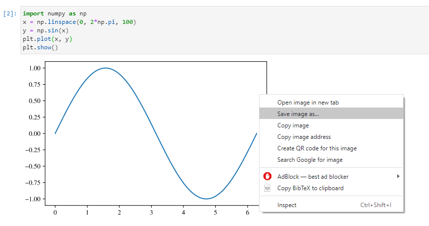
The plot itself looks like this. It is already vector graphics that allows you to zoom in really close!

In order to use this image in LaTeX, we need to use the svg package, which uses inkscape to convert SVG files to PDF for LaTeX to include them.
\documentclass{article}
\usepackage{svg}

\begin{document}
\includesvg[width=0.5\linewidth]{my-svg.svg}
\end{document}
The main limitation of this approach is that contents in math mode do not look very nice. It also does not external math fonts.
Choosing SVG font embedding method
According to the documentation, there are several ways to embed fonts in the SVG file:
#svg.fonttype : 'path'         # How to handle SVG fonts:
#    'none': Assume fonts are installed on the machine where the SVG will be viewed.
#    'path': Embed characters as paths -- supported by most SVG renderers
#    'svgfont': Embed characters as SVG fonts -- supported only by Chrome,
#               Opera and Safari
By default, fonts are embedded as curves. This behavior can be changed with:
import matplotlib.pyplot as plt
plt.rcParams['svg.fonttype'] = 'none'